Friday, 31 October 2014

Bloomberg's multi-screen VR, resolution multiplier, and the rotating eggcup transform

Bloomberg are demonstrating a demo of a multi-window desktop mapped into 3D VR viewable through an Oculus Rift:

It is counter-intuitive that you'd want to look at 20 displays, each of (say) 20" @ 1600x1200 resolution (i.e. a 8000x4800 pixels display area) through glasses with 2x960x1080 pixels. Ok, I agree, the view is going to be pretty dire and you will get neck ache, but it doesn't seem to be as bad as viewing 8000x4800 at 960x1080 should suggest, because you can swing your head around and lean-in to view any screen in more detail.
A 'resolution multiplier' of 37 (i.e. pixel count of display area / pixel count of Rift)  as suggested here is wayyy too much to be optimal, but when (not if) higher resolution VR glasses become available the ratio for this demo will come crashing down.

To display the screens effectively, rather than having the screens static in the VR space (i.e. rendered on the inside of a sphere centered on the user's head), we should use a transform that enlarges the screen in the center of the users view while compressing the edges.  This is a bit like the distortion of a reflection you see in a spoon, or as in this drawing by Escher:
Say this sphere were used... as you look around you need the sphere to appear to roll around you, showing more of the left or right as your head rotates.
Or you can visualize the same concept viewing an Earth globe:
The 'sphere' distortion (aka transformation) is useful to illustrate the point, but actually you want a wierd cylindrical object where the top and bottom of the cylinder curve towards you, a bit like an eggcup, something like:
The shape above is a hyperboloid which is a reasonable approximation to what you could use. The console images would only wrap around the front section (so every console is in view) and the shape would appear to rotate as you turned your head, a bit like a rotating teacup viewed from the teapot (alhough we're using a single eggcup...)


 The cylinder could rotate in front of an apparently stationary background so the VR isn't too disorienting.

So I name this technique the rotating eggcup transform...

Tuesday, 28 October 2014

Oculus Rift supports 'high resolution' desktops via a resolution multiplier effect

Here's an interesting scientific detail: for virtual desktop use the relatively-low-res Oculus Rift DK2 actually feels higher resolution than it really is, because of the way you can pan around a large virtual screen, and lean in for a closer look. For desktop use this is a resolution multiplier effect.

The Oculus Rift VR DK2 headset has a native resolution of 2 x 960 x 1080 (i.e. it's a 1920x1080 HD display split vertically in two).

So you could assume this makes for a fairly poor display to present a standard computer desktop, e.g. via the Virtual Desktop.

It is true the headset can only display 960x1080 pixels at a time but if you define a desktop of (say) 1920x1080 it is relatively convenient to move your head around to see the full content. Not the same as the full resolution, but a lot more convenient than having a scrollable virtual desktop you move left and right on via the keyboard.

This may actually pay off when a later VR headset really does have the resolution you want for each eye (I don't know, maybe WQXGA i.e. 2 x 2560 x 1600) but actually your desktop can appear much larger (e.g. 5K) because now you have more than enough within the 'current window' but can pan around (by moving your head) to other displayed information.

So unlike the Virtual Desktop mentioned at the start of this post, maybe the 5K+ larger display I'm suggesting should be virtually curved, and appear to wrap around the user. So this brings us full circle (pun intended) to the curved requirement for large displays that I've referred to in regard to real monitors earlier in this blog.

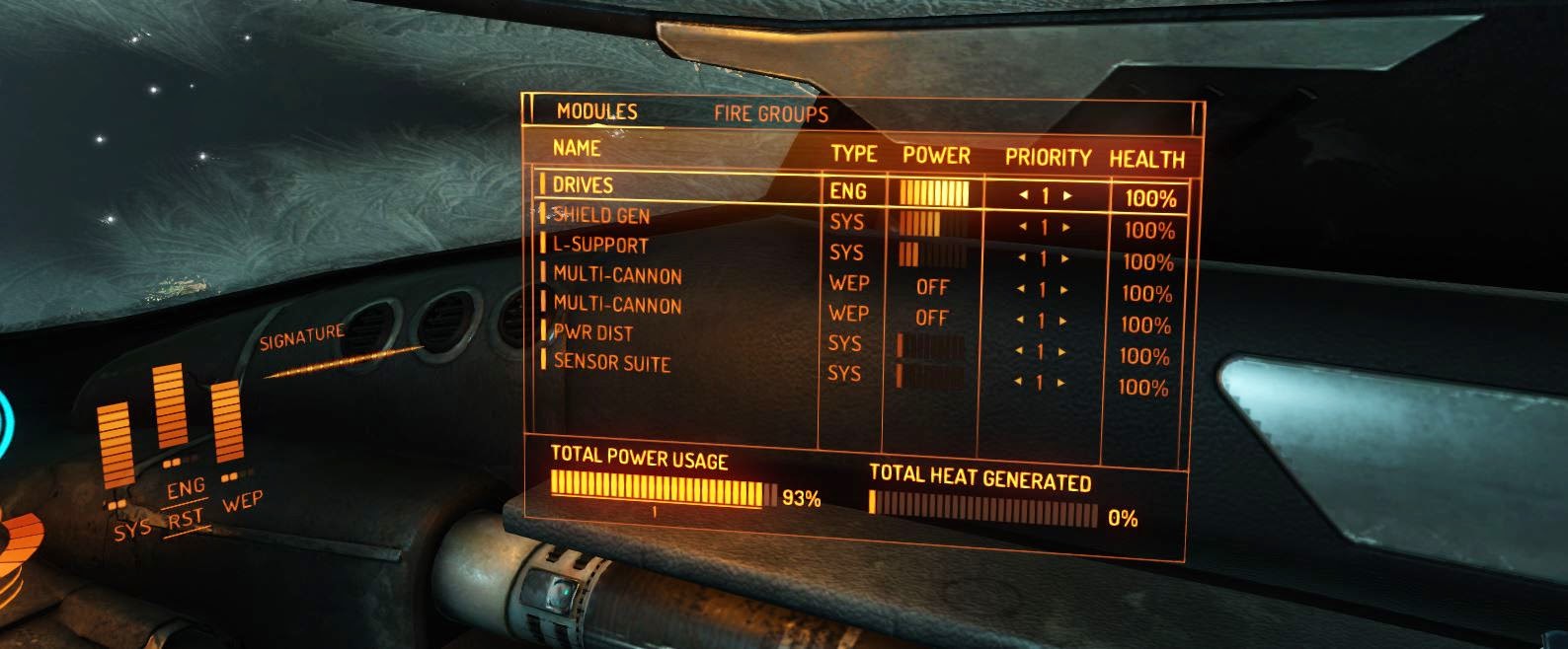
Games, as always, explore new tech ideas before anything else. On this Elite:Dangerous video, see how the wrap-around 'user interface' has many more pixels than the window of the users real-time view...
https://www.youtube.com/watch?v=1FWOUwdBQdY

Monday, 27 October 2014

WTF? The Google Inbox website is kinda broken

In an interesting twist in the 'what's important to the end user' industry soap opera, the Google website promoting Google Inbox makes some interesting design choices regarding web usability. In particular it discards the concept of web 'links'. Really? So the page for 'Request Invitation' shouldn't have a URL? I can't link readers of this blog to the 'highlights' page?

There's a lot of dynamic scrolling going on but ultimately the entire 'site' is served via a single web URL, a la full-page Flash sites of maybe a decade ago.

The HTML 5 developers did a good thing introducing features that removed the need for Flash. But if Google developers buy into the Flash-style website-as-a-single-page model then others are definitely going to do that, and we're going to head off on a detour on the interweb superhighway.

Maybe I'm just out of date. Apps are the way to go, the internet is just wrong.

Although, seriously, as posted earlier, I think the assessment of user value from Google for Inbox is misguided (in spite of the Google-Wave-like effusive user enthusiasm currently in the TwitterSphere), and the Google inbox website is actually symptomatic of a glossy marketing-led fire-and-forget approach.

If Google really wanted to see if Inbox is a killer app, they should quietly make it available as a slightly inelegant beta, and see if it goes viral.

Sunday, 26 October 2014

Google announces Gmail Google Inbox: a clever idea that misses the point

After the failure of Google Wave (now Apache Wave), Google is having another try with Google Inbox. They are missing the point, and here's why:

Fundamentally, deeply and irrecoverably, email developers (like those on Gmail, but also all the others like Microsoft Outlook) cannot get their head around the fact that the actual email message is not the defining core central element of an email platform. It was a great concept to center all the functionality around the messages when these were infrequent and all the technical resources at the developers disposal were 100% absorbed in the exciting complexity of transferring a message from A to B and storing and displaying them.

When technology moved forward a bit and storage of text emails was less of a state-of-the-art problem, the email developers kept the message as the 'core object' of the system but added the innovation of being able to store those messages under the concept of folders. This was simplistic and inevitable if you realised that emails were typically stored as plain text files on the system so email folders had an easy, obvious but limiting implementation of storing those messages in file-system folders (i.e. directories) on the computer.

Google Wave kept the concept of the message as the core defining element of the system but linked them together in threads/waves/conversations. If you have a sense of how email works (i.e. one person sends an email with a given subject line, others might reply) you can see how displaying 'threads' is a thing you might do to messages about as obviously as putting them in folders. But it doesn't alter the fundamental premise that the message is the core defining element of the system.

Things have changed. The person that sent the message is a more important defining core data concept than the ephemeral thing that is the actual message, but email clients (and, surprisingly, Google Inbox) still stick to the notion that the key problem to be addressed is connecting YOU to your MESSAGES.

Actually, more important is connecting YOU to the OTHER PEOPLE YOU KNOW. Email systems do a good job of enabling you to see or send messages, put them in folders, see them in threads, search for messages and a host of other message-centric things, but actually provide very weak support around the concept of people.

There is a a simple way of illustrating this limitation in any email client. Anywhere in the system you see a reference to a message (e.g. in a list of messages in a folder) you can click on the message headline (e.g. the subject appearing in the inbox) and BOOM, you go straight to that message. Obvious, no? But anywhere you see a person mentioned (e.g. in the 'from' field of a message, or even in your address book) the support is weak, fragmented and hard to predict. Next time you look at an email, try clicking on the email address in the 'from' field and see what is does. Typically nothing, maybe it allows you to copy that email address, maybe (but unlikely) it takes you to the address book.

The only sensible solution is to treat person (referenced by email address)  as a first-class data object everywhere in the system. In the same way that clicking on an email message subject always takes you to the comprehensive display of that message, clicking on a person reference should always take you to an enriched definitive display for that person. Even simple email clients have useful information to display in that context (all emails to/from that person), and often this could be implemented as an extension of the existing address book functionality (currently inboxes and address books all appear to have been written by independent developers even when bundled together in the same client.

I've explored this issue in a hack to the email Roundcube client, making person more of a central element.